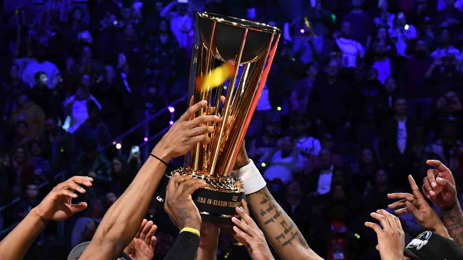
The NBA's in-season tournament is back with a new name and a new look.
The league has rebranded the event as the NBA Cup moving forward after holding the tournament for the first time last season.
Along with competitive games, the in-season tournament featured some eye-popping court designs to distinguish those contests from ordinary regular season games.
The NBA is bringing back the colorful courts, but teams got some more freedom with their individual designs. Instead of each court having a stripe from baseline to baseline, organizations got to put their own spin on their NBA Cup courts for the second edition.
We've got the news you need to know to start your day. Sign up for the First & 4Most morning newsletter — delivered to your inbox daily. Sign up here.
The @emirates NBA Cup courts are here... Which team has your favourite?! pic.twitter.com/E9bdm4yPTI
— NBA Canada (@NBACanada) October 24, 2024
Let's run through the top five and bottom five NBA Cup courts for the 2024 event.
Best NBA Cup courts for 2024
Portland Trail Blazers

Perfection. Portland embracing its title as the City of Roses in a subtle but stunning way.
Charlotte Hornets

The Hornets have dabbled with the beehive design on their court, jerseys and logos before. This one might be the best of the bunch.
Brooklyn Nets

Sometimes you'll turn on a Nets game and wonder if you accidentally set your TV to black and white because of their gray court. That said, this sleek design works.
Los Angeles Lakers

The Lakers will try defending their in-season tournament title in style. This design could maybe use a little more contrast, but the skyline and palm trees are quintessential L.A.
Houston Rockets

The color will certainly take some getting used to. However, the HAL 9000 look is a cool idea.
Worst NBA Cup courts for 2024
Detroit Pistons

This one is kind of like a fever dream. Also, don't love "Detroit" being spelled upside-down on the nearside out of bounds.
Golden State Warriors

This one was a missed opportunity. Like many teams, the Warriors went with a background logo behind the halfcourt logo, but it could have gone with the Golden Gate Bridge.
Toronto Raptors

The Raptors have A+ Classic Edition jerseys. However, the barbed stripes on the court look like yard lines on a football field.
Denver Nuggets

"Mile High City" is better than "5280," which has been the mantra on the team's City Edition jerseys, but better doesn't mean good.
Washington Wizards

The color scheme isn't bad, but the part of the logo the team decided to highlight in the background is a head-scratcher.


